Rebranding for the company anniversary
The existing appearance should not be completely revised and replaced. Various elements and components of branding are still up-to-date and are good for us. The whole subject of space has not become a bit less appropriate and will continue to be used as a “playground” for representation. We also see no immediate need for changes in the use of the Museo font family, although we are relying more on the sans serif “Museo Sans” than on the two serif fonts in the family. And yet there were interventions that markedly change the existing image.
The Logo
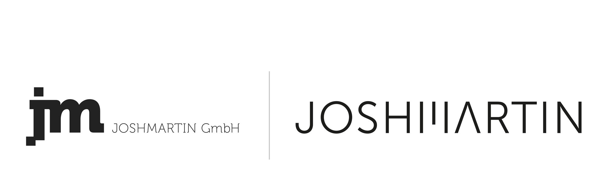
The original version was created when the company was founded and its formal appearance addressed the duality between development and design, the core competencies of the two founders. The “j” was stripped of its curves and should thus be reminiscent of pixels and symbolize the comparatively rational level of the digital world. In its connection with the “m”, which kept its “soft” looking curves in the arches, a bridge was built between the two worlds.
old and new
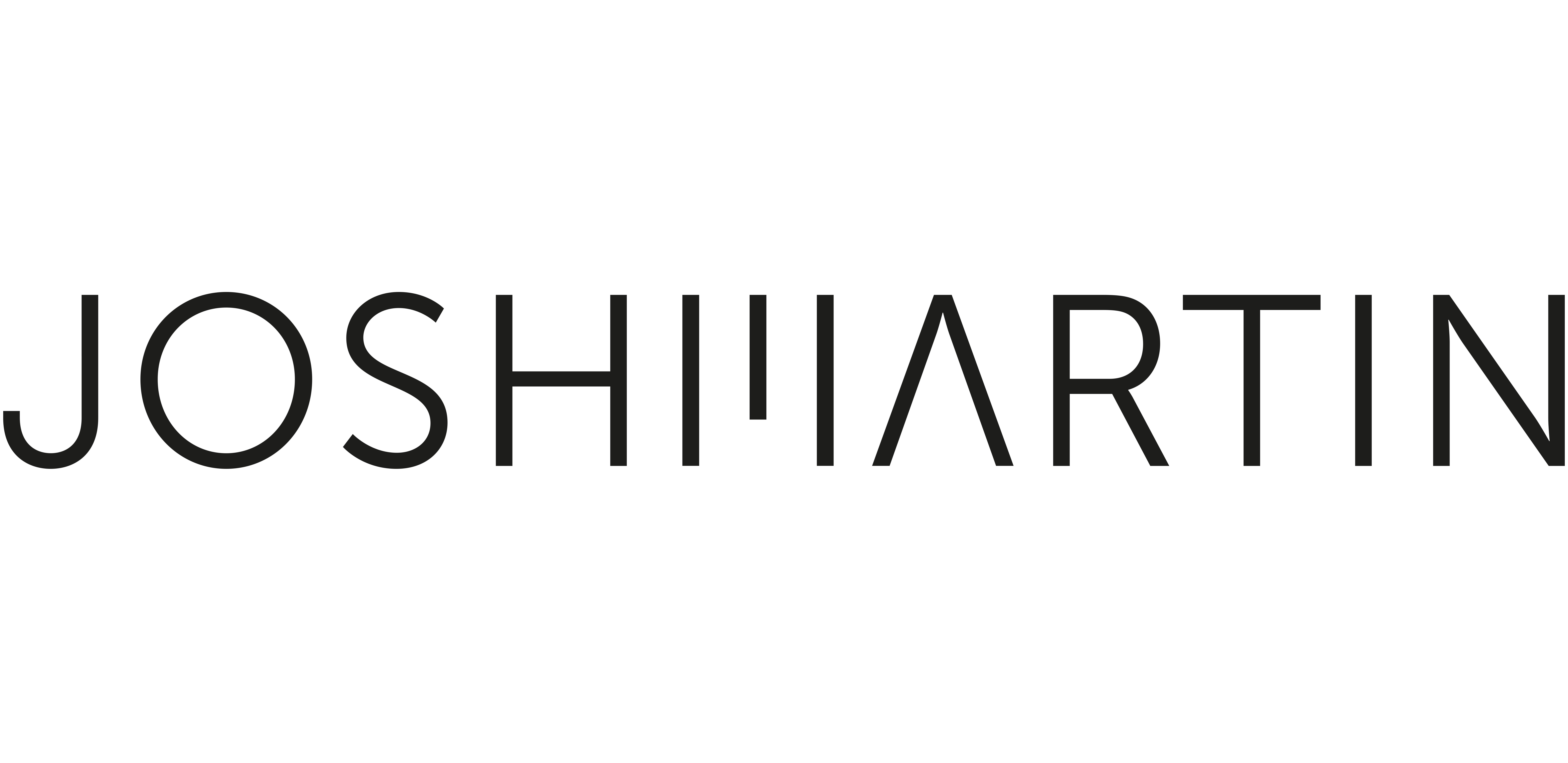
Compared to the original version, the new logo was designed as a pure word mark. It only contains capital letters from the “Museo Sans”, some of which have been marked with minimal interference. The tapering diagonals of the “M” were reduced to a single smear and thus “coded” in a certain way. In addition, based on a vertical (or flying) missile, the horizontal line from the “A” was removed.
![]()
Development process of the new logo
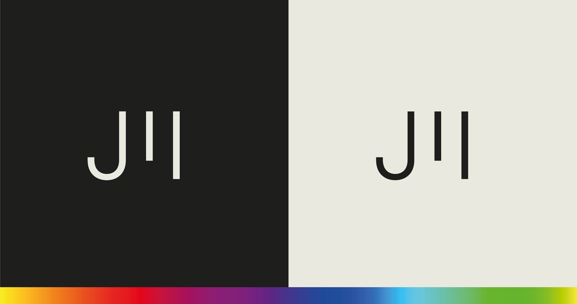
Due to the space requirements in terms of width, a short version was developed as a signet in addition to the word mark. This can be used wherever space is limited or the proportions are unfavorable, although the full version enjoys clear priority.

Short version as signet
Colors
The originally defined colors were never used so strictly according to the manual. Although there were clearly defined primary and secondary colors in several gray values, these were used increasingly sparsely. This has prompted us to try to use colors in a slightly different way. Two primary colors, each light and dark, should form the predominant basis. The use of colors should be reduced to a minimum. More conscious and targeted, then the colors should also be allowed to work: striking, courageous and free of restrictive definitions.
Restrained color concept
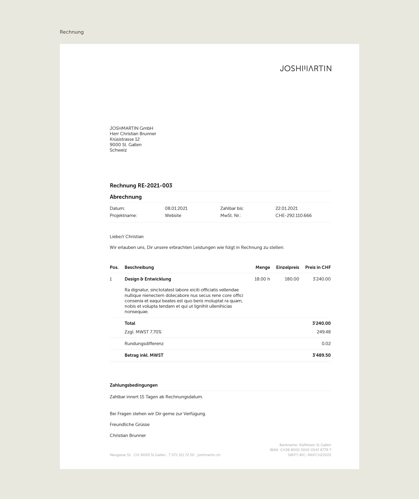
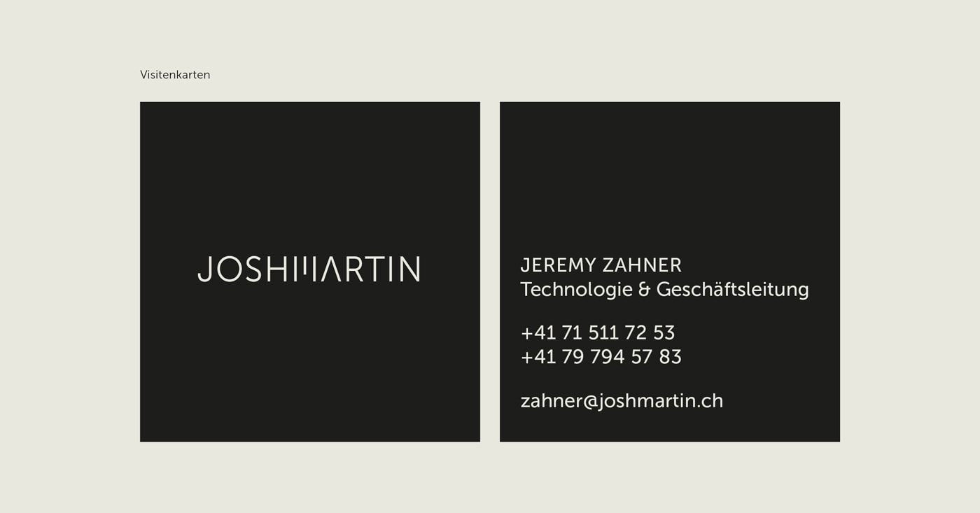
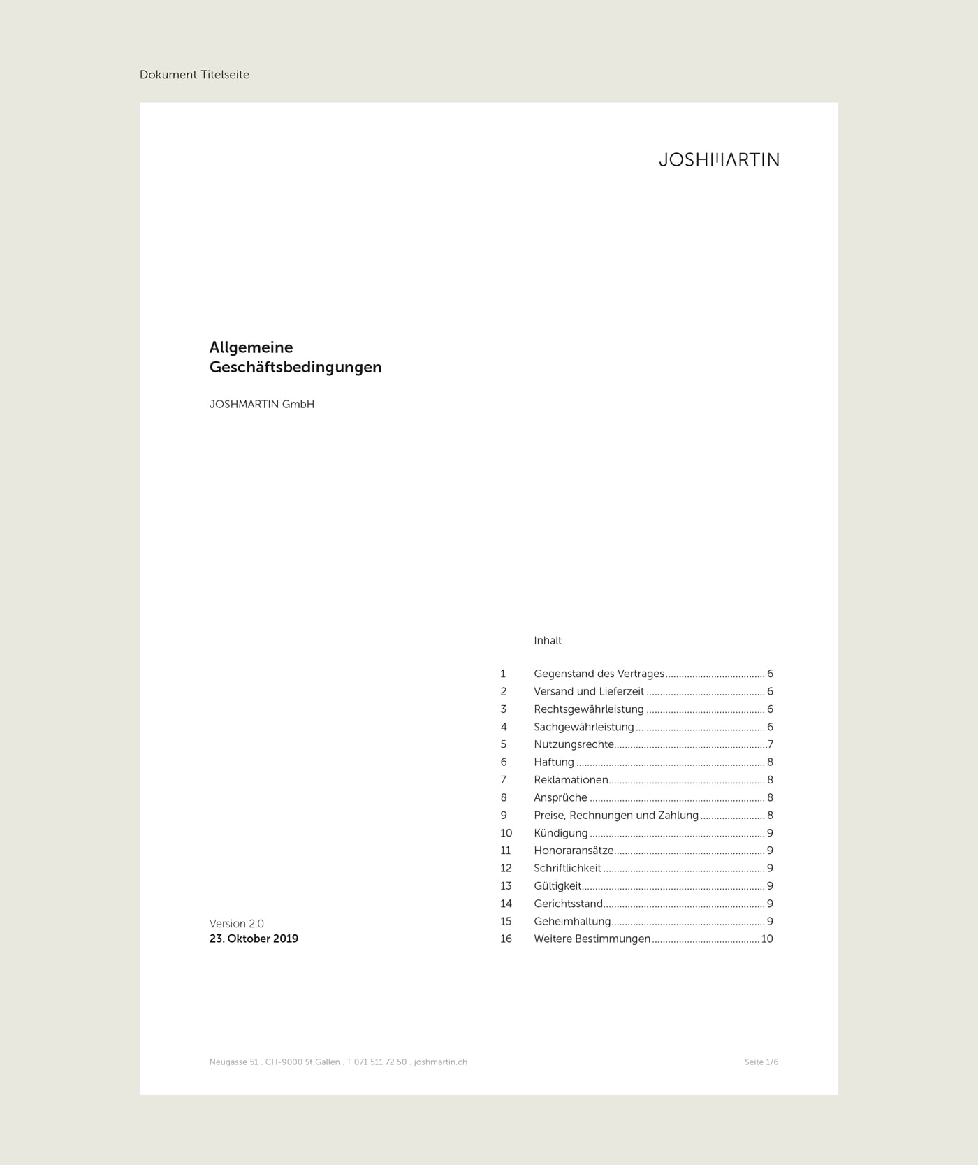
Print matters and signage
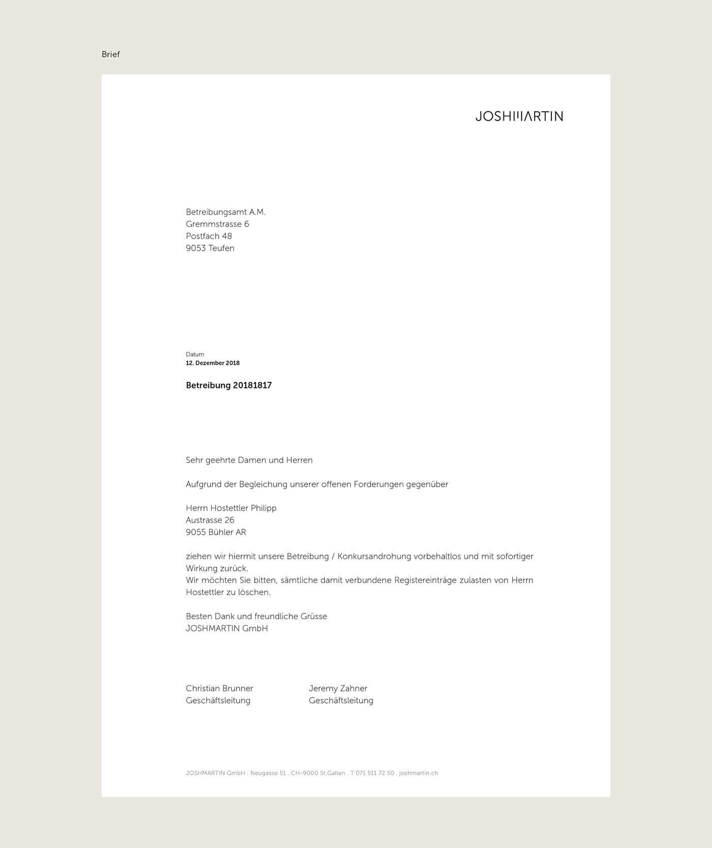
Although most of our business communication takes place via digital channels, of course we cannot do completely without classic printed matter and appropriate templates. Of course, stationery, invoices, offers and business cards also had to be adjusted. In addition, our office on Neugasse wanted to be re-labeled.
For further adjustments such as the office lettering, we plan to bring our new ambassador into play. The relevant preparations are in progress and will be implemented in due course and will become visible on site.