acrevis Design System – Component Library
The online services of acrevis include various applications and websites, all of which have to be maintained and continuously developed. The greater the number of active applications, the more important centralized systems become for maintenance and global adjustments. A prime example of this are developments or changes to the visual components in the user interfaces of the applications. In favor of a uniform appearance and rapid maintenance across all instances, we were asked to implement a design system.
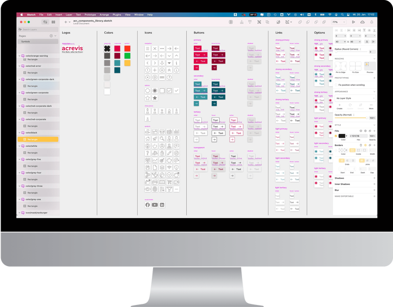
Since we had already implemented several projects with acrevis at the start of the project, a considerable collection of visual components was already existing. The typographical basis, a set of icons, and the most important interactive elements such as buttons, links, and input fields were defined and already in use. All these elements first had to be brought together in an online library and made available for the web applications. In the long term, every possible design component should be included in the library and integrated into the applications from there. This not only allows the development of new UIs to be more efficient but also makes adjustments and optimizations across all active instances easy and quick, as they only have to be carried out in one place.
Because the design system is accessible to all authorized parties, the design system represents a great added value to everyone working on the applications, including third-party suppliers.
The component library includes most of the UI patterns in use, such as buttons, links, input fields, sliders, etc.
The icon library contains all icons and symbols that are used in the applications and websites. New icons are continuously added to the library and made available as .svg and .eps files.
All basic styles such as colors and fonts are listed in the style guide. Project-specific deviations are excluded.